2025 * 4 MONTHS * WEB
2025 * 4 MONTHS * WEB
Aprimpresa: A public administration service
MY TEAM
MY TEAM
5 Designers
5 Designers
me!
2 Product managers / instructors
2 Product managers
MY ROLE
MY ROLE
UX & UI design
Design system
UX & UI design
Design system
LONG STORY SHORT
Aprimpresa is a digital platform that guides first-time entrepreneurs through the Italian business registration process, helping them understand legal requirements, make informed decisions, and complete administrative steps independently.
Aprimpresa is a digital platform that guides first-time entrepreneurs through the Italian business registration process, helping them understand requirements, make informed decisions, and complete administrative steps independently.
I worked on the end-to-end UX and UI design of a digital platform that helps first-time entrepreneurs register a business independently. Using research, user testing, and iterative prototyping, our team transformed a fragmented legal process into a guided experience that reduces uncertainty while maintaining trust.
I worked on the end-to-end UX and UI design of a digital platform that helps first-time entrepreneurs register a business independently. Using research, user testing, and iterative prototyping, our team transformed a fragmented legal process into a guided experience that reduces uncertainty while maintaining trust.
OUTCOME
80%
described the system as trustworthy
90%
correctly identified the next step
80%
reported the system felt manageable
SNEAK PEAK
Key features & flows
BUSINESS SETUP
Users fill out a form giving their business details and the system recommends their business structure type and creates their business profile.
Users fill out a form giving their business details and the system recommends their business structure type and creates their business profile.
ROADMAP VISUAL
Business details are analyzed to understand which steps the user must complete and are given to the user through a roadmap homepage.
Business details are analyzed to understand which steps the user must complete and are given to the user through a roadmap homepage.
GUIDED STEP COMPLETION
Steps guide the user from document filling all the way up to receiving feedback from public administration offices.
Steps guide the user from document filling all the way up to receiving feedback from public administration offices.
RESEARCH
How might we help first-time entrepreneurs navigate Italian bureaucracy independently without changing the legal process itself?
We began by understanding why starting a business in Italy felt overwhelming for first-time entrepreneurs. Through desk research, competitor analysis, interviews, and usability testing, we mapped where users became confused, which decisions required external support, and which parts of the process created the greatest uncertainty.
We began by understanding why starting a business in Italy felt overwhelming for first-time entrepreneurs. Through desk research, competitor analysis, interviews, and usability testing, we mapped where users became confused, which decisions required external support, and which parts of the process created the greatest uncertainty.

1x
1x
PROBLEM
The research revealed that uncertainty and lack of trust were driven by the absence of a clear, consistent path through the business registration process
Interviews with entrepreneurs showed that opening a business rarely followed the same process twice. Requirements changed depending on the business, the office involved, and how individual public administration officials interpreted overlapping regulations. As a result, entrepreneurs could receive different answers to the same question, making it difficult to know which guidance to trust or what step to take next.
Interviews with entrepreneurs showed that opening a business rarely followed the same process twice. Requirements changed depending on the business, the office involved, and how individual public administration officials interpreted overlapping regulations. As a result, entrepreneurs could receive different answers to the same question, making it difficult to know which guidance to trust or what step to take next.
GOALS
Users
*
*
Help entrepreneurs confidently navigate the business registration process
Help entrepreneurs confidently navigate the business registration process
*
*
Reduce uncertainty by providing clear guidance at every stage
Reduce uncertainty by providing clear guidance at every stage
Business
*
*
Reduce reliance on intermediaries through self-service support
Reduce reliance on intermediaries through self-service support
*
*
Integrate AI in ways that improve decision making
Integrate AI in ways that improve decision making
PROCESS
Because the legal process itself could not be simplified, the challenge became deciding where design could reduce uncertainty without changing the underlying bureaucracy.
Structuring decisions instead of answering questions
AI integration was a project requirement, and our early concepts explored assistant style conversations. I was concerned this would add another layer between entrepreneurs and the legal process without addressing the real problem: users needed structure, not another place to ask questions. If AI became the primary source of guidance, it also risked reducing trust by making legal decisions feel less transparent.
AI integration was a project requirement, and our early concepts explored assistant style conversations. I was concerned this would add another layer between entrepreneurs and the legal process without addressing the real problem: users needed structure, not another place to ask questions. If AI became the primary source of guidance, it also risked reducing trust by making legal decisions feel less transparent.
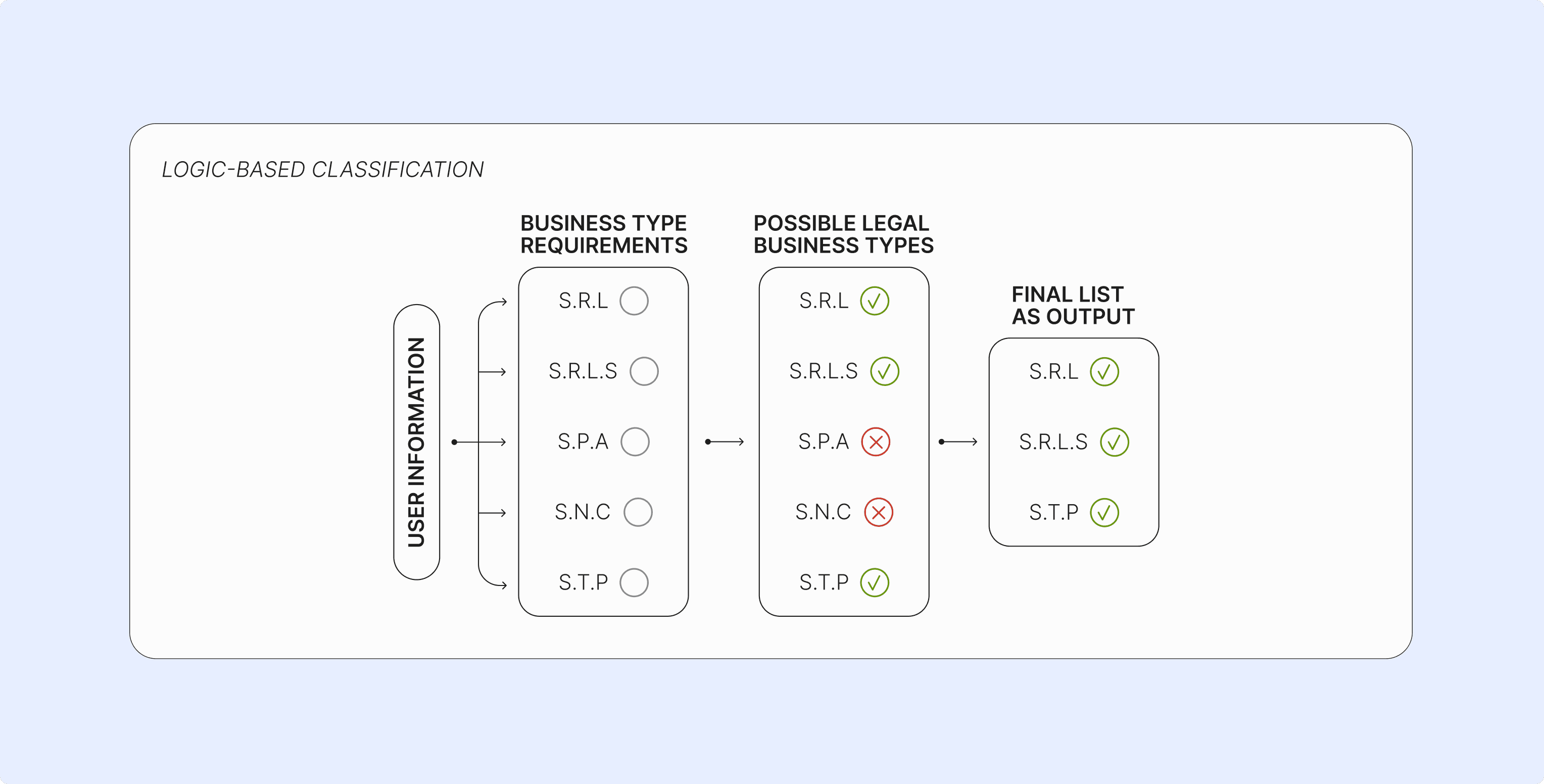
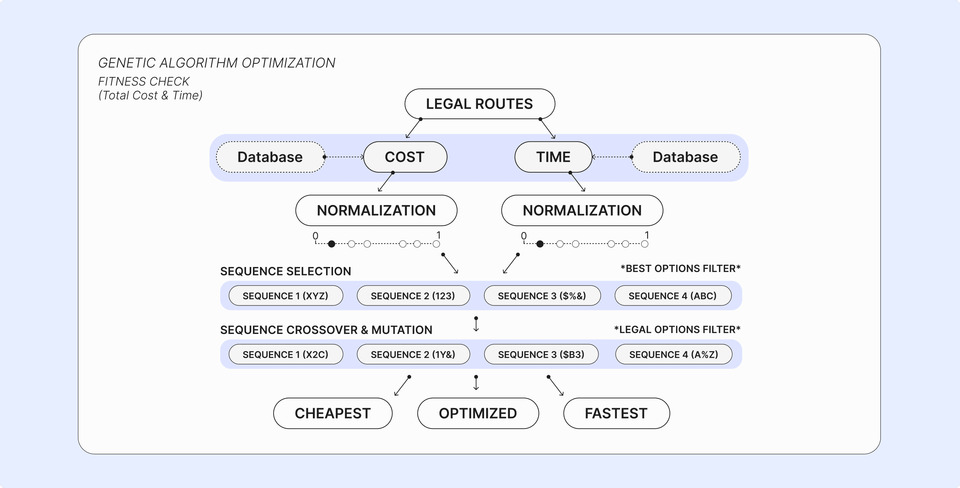
Instead, we proposed using AI only at key decision points. A guided onboarding collects the user's context, then AI recommends the most suitable business structure and explains why, helping users make informed decisions while keeping the overall process transparent. These inputs are then used to create the sequence of steps the user must take to legally register their business.
Instead, we proposed using AI only at key decision points. A guided onboarding collects the user's context, then AI recommends the most suitable business structure and explains why, helping users make informed decisions while keeping the overall process transparent. These inputs are then used to create the sequence of steps the user must take to legally register their business.

1x
1x
ONBOARDING FORM
Allows the system to gather the important details about the user's business which leads to the creation of their personal roadmap.
Allows the system to gather the important details about the user's business which leads to the creation of their personal roadmap.

1x
1x
SELECT BUSINESS STRUCTURE
If the user hasn't previously determined their business structure, the system also recommends the best suited options based on the form.
If the user hasn't previously determined their business structure, the system also recommends the best suited options based on the form.
Building around the journey, not the paperwork
One of my teammates proposed organizing the legal process as a personalized roadmap, shifting the experience away from disconnected forms and toward a clear sequence of steps. I expanded this concept by integrating document completion, payment, and submission directly into the platform, reducing the need for entrepreneurs to switch between multiple government websites.
One of my teammates proposed organizing the legal process as a personalized roadmap, shifting the experience away from disconnected forms and toward a clear sequence of steps. I expanded this concept by integrating document completion, payment, and submission directly into the platform, reducing the need for entrepreneurs to switch between multiple government websites.

1x
1x
Rather than treating the roadmap as a checklist, each step explains why it matters, what information is required, and dynamically adapts to the user's context. This keeps entrepreneurs moving through a single, continuous experience instead of navigating fragmented systems.
Rather than treating the roadmap as a checklist, each step explains why it matters, what information is required, and dynamically adapts to the user's context. This keeps entrepreneurs moving through a single, continuous experience instead of navigating fragmented systems.
TESTING & ITERATION
Testing challenged several of our early design decisions and revealed opportunities to better align the platform with user expectations, business goals, and legal constraints
Guerilla Testing
Ten (10) participants (age 20-35) tested to identify usability issues and validate early design decisions.
Ten (10) participants (age 20-35) tested to identify usability issues and validate early design decisions.
*
*
Complete a list of tasks while thinking aloud
Complete a list of tasks while thinking aloud
*
*
Rate confidence after each task and discuss areas of uncertainty
Rate confidence after each task and discuss areas of uncertainty
Delaying account creation
My initial flow required users to create an account before beginning onboarding. Testing showed this introduced unnecessary friction by asking users to commit before they had received any value from the platform.
My initial flow required users to create an account before beginning onboarding. Testing showed this introduced unnecessary friction by asking users to commit before they had received any value from the platform.

1x
Before
Being immediately asked to create an account before being shown the value of the system.
Being immediately asked to create an account before being shown the value of the system.

After
Users complete the business structure form before being asked to create an account.
Users complete the business structure form before being asked to create an account.
I moved account creation to the end of onboarding, after users had received their recommended business structure. This allowed entrepreneurs to understand the platform's value before being asked to register, creating a smoother first experience.
I moved account creation to the end of onboarding, after users had received their recommended business structure. This allowed entrepreneurs to understand the platform's value before being asked to register, creating a smoother first experience.
Reducing information overload
During guerrilla testing, participants consistently scrolled past the step details and selected 'Continue' without reading the information. Rather than removing the content, I identified that important details were competing for attention with extra information that didn't serve the user's goal.
During guerrilla testing, participants consistently scrolled past the step details and selected 'Continue' without reading the information. Rather than removing the content, I identified that important details were competing for attention with extra information that didn't serve the user's goal.

1x
Before
Long scroll format with paragraphs of information led to users scrolling past without reading.
Long scroll format with paragraphs of information led to users scrolling past without reading.
1x
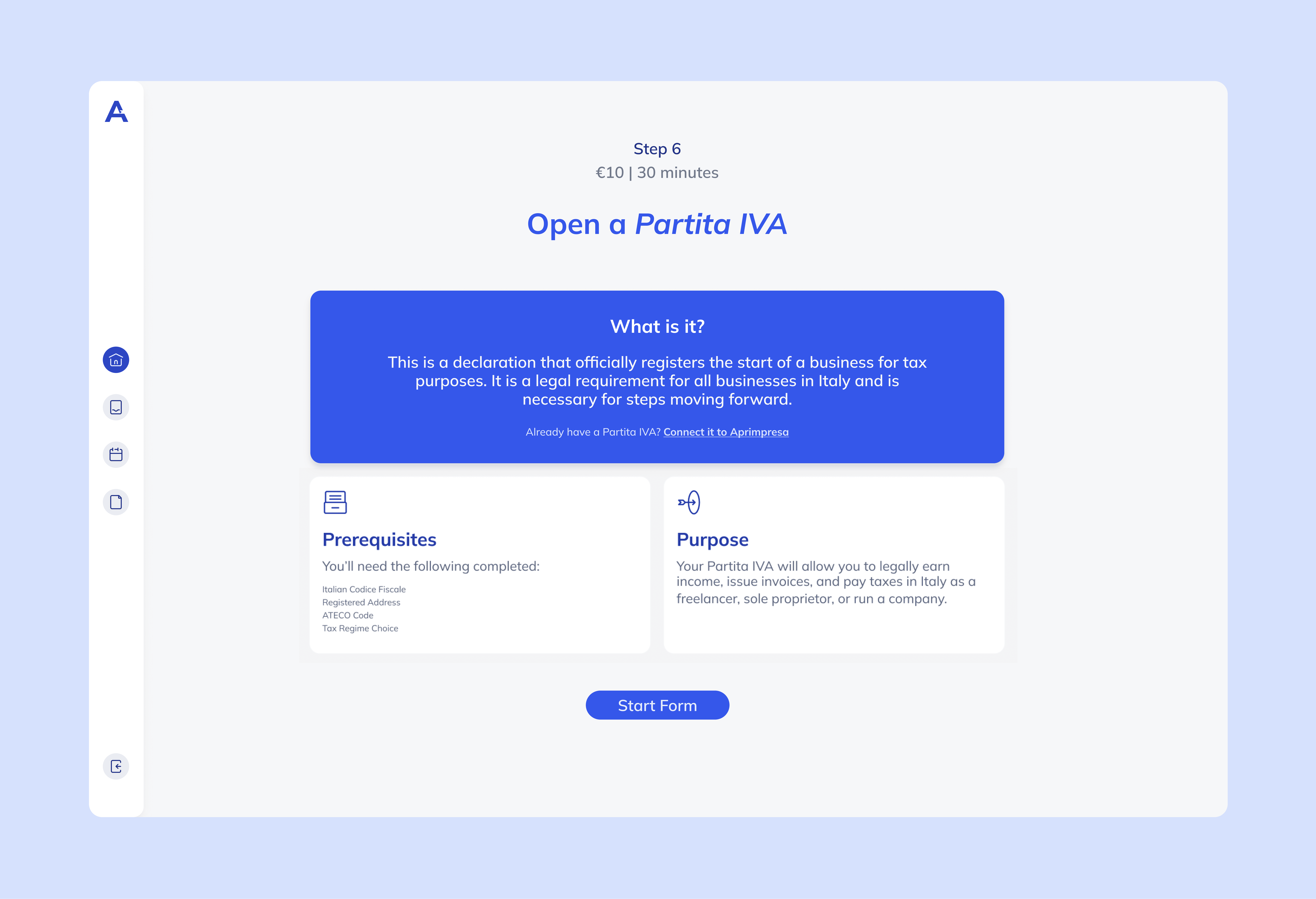
After
Limited to a brief description of the core details necessary to know before starting.
Limited to a brief description of the core details necessary to know before starting.
I restructured the step overview into three clear sections: a short description of the task, a checklist of prerequisites, and the purpose of the step. This made key information easier to scan while keeping additional context readily available when users needed it.
I restructured the step overview into three clear sections: a short description of the task, a checklist of prerequisites, and the purpose of the step. This made key information easier to scan while keeping additional context readily available when users needed it.
Usability Testing
Five (5) participants (entrepreneurs) tested to evaluate the refined prototype.
Five (5) participants (entrepreneurs) tested to evaluate the refined prototype.
*
*
Complete a list of tasks while thinking aloud
Complete a list of tasks while thinking aloud
*
*
Rate confidence after each task and discuss areas of uncertainty
Rate confidence after each task and discuss areas of uncertainty
*
*
A/B testing the tone of the interface (friendly vs. professional)
A/B testing the tone of the interface (friendly vs. professional)
Choosing credibility over friendliness
Our first visual direction leaned toward a friendlier, more conversational interface to reduce the stress of bureaucracy. I was concerned that this approach would undermine confidence in a platform responsible for legal and financial decisions, so I proposed A/B testing it against a more professional alternative.
Our first visual direction leaned toward a friendlier, more conversational interface to reduce the stress of bureaucracy. I was concerned that this approach would undermine confidence in a platform responsible for legal and financial decisions, so I proposed A/B testing it against a more professional alternative.

1x
Before
Playful visual direction brings focus away from tasks through competing elements and fails to take on the tone of a government website.
Playful visual direction brings focus away from tasks through competing elements and fails to take on the tone of a government website.

1x
After
The design remains approachable while maintaining an appropriate level of restraint. Focus stays on the users primary task.
The design remains approachable while maintaining an appropriate level of restraint. Focus stays on the users primary task.
Participants consistently trusted the more professional direction while still responding positively to approachable language and subtle moments of warmth. The final visual identity combines the credibility of the professional concept with these carefully selected elements from the friendlier version.
Participants consistently trusted the more professional direction while still responding positively to approachable language and subtle moments of warmth. The final visual identity combines the credibility of the professional concept with these carefully selected elements from the friendlier version.
Embedding guidance into the workflow
Participants consistently opened the help mascot, immediately closed it, and returned to the document without reading the explanation. This suggested that the existing help content was not supporting users effectively during form completion.
Participants consistently opened the help mascot, immediately closed it, and returned to the document without reading the explanation. This suggested that the existing help content was not supporting users effectively during form completion.

1x
Before
Prompts and tips were buried under an interaction, creating friction and minimizing value. This left the form lacking useful guidance for the user.
Prompts and tips were buried under an interaction, creating friction and minimizing value. This left the form lacking useful guidance for the user.

1x
After
I incorporated a side panel that navigates the user through their required inputs, with a visualized panel on the left showing which pages still need to be completed.
I incorporated a side panel that navigates the user through their required inputs, with a visualized panel on the left showing which pages still need to be completed.
Rather than removing guidance from the form, I integrated it directly into the experience. Each required input is now listed in a dedicated side panel with clear descriptions, allowing users to move through the document field by field instead of searching for missing information. I also proposed automatically skipping fields that were not relevant to the user's business profile, reducing unnecessary effort while keeping the process focused.
Rather than removing guidance from the form, I integrated it directly into the experience. Each required input is now listed in a dedicated side panel with clear descriptions, allowing users to move through the document field by field instead of searching for missing information. I also proposed automatically skipping fields that were not relevant to the user's business profile, reducing unnecessary effort while keeping the process focused.
OUTCOME
High-fidelity usability testing evaluated the redesign against the project's primary goals, resulting in the following:
High-fidelity usability testing evaluated the redesign against the project's primary goals, resulting in the following:
80%
80%
described the system as trustworthy
described the system as trustworthy
90%
correctly identified the next step
80%
reported the system felt manageable
90%
correctly identified the next step
80%
reported the system felt manageable
1
1
If any changes could be made in the future, I would design a dual-facing system to allow public administration officers to work directly within the system. This could help the process to become even more efficient.
If any changes could be made in the future, I would design a dual-facing system to allow public administration officers to work directly within the system. This could help the process to become even more efficient.

createdbylib@gmail.com
© 2026 Libby Wilken
createdbylib@gmail.com
© 2026 Libby Wilken
createdbylib@gmail.com
© 2026 Libby Wilken