2026 * 6 MONTHS * WEB & MOBILE
2026 * 6 MONTHS * WEB & MOBILE
Phaidrox: An educational annotation tool
1x
1x
MY TEAM
MY TEAM
1 Designer
1 Designer
me!
1 Product manager
1 Product manager
2 Developers
2 Developers
MY ROLE
MY ROLE
UX research
Product & UI design
Design system
UX research
Product & UI design
Design system
LONG STORY SHORT
Phaidrox allows instructors to see how students engage with course content through their annotations, while also collecting student feedback
I worked as the sole designer, leading the end-to-end redesign of the Phaidrox platform, previously known as EVOLI. Using Figma, Figma Make, and Claude Design, I restructured the product from the ground up. Starting with the information architecture and feature strategy, then designing the complete user experience and interface before handing off the final designs to development.
I worked as the sole designer, leading the end-to-end redesign of the Phaidrox platform, previously known as EVOLI. Using Figma, Figma Make, and Claude Design, I restructured the product from the ground up. Starting with the information architecture and feature strategy, then designing the complete user experience and interface before handing off the final designs to development.
OUTCOME
68%
of students voluntarily submitted feedback
37%
less time to locate key course insights
76%
students felt acknowledged by instructors
SNEAK PEAK
Key features & flows
FACILITATING COMMUNICATION
Instructors and students can leave timestamped annotations on course content, giving clarity to both parties. Additionally, instructors can tag annotations as "For Later" signaling to students that their input will be addressed.
Instructors and students can leave timestamped annotations on course content, giving clarity to both parties. Additionally, instructors can tag annotations as "For Later" signaling to students that their input will be addressed.
FEEDBACK & INSIGHTS
Students are invited to give feedback on
each course item, allowing them to voice their experience with the course. Instructors receive the anonymous feedback along with course data reports that summarize course performance.
Students are invited to give feedback on each course item, allowing them to voice their experience with the course. Instructors receive the anonymous feedback along with course data reports that summarize course performance.
INCREASING PERCEIVED VALUE
Students can complete quizzes for each course item and track their progress using a study list. Instructors benefit from increased visibility
into student activity, enabling them to foster engagement and create a positive feedback loop that encourages continued participation.
Students can complete quizzes for each course item and track their progress using a study list. Instructors benefit from increased visibility into student activity, enabling them to foster engagement and create a positive feedback loop that encourages continued participation.
RESEARCH
How might we design to foster better communication, engagement, and trust?
I began with an independent evaluation of the existing platform and compared my findings with earlier system analyses to identify recurring usability issues and gaps in prior assessments.
To better understand user needs and the broader context, I combined a literature review, competitive analysis, user surveys, the shortened User Experience Questionnaire (UEQ), and journey mapping. Surveys with students and instructors helped surface expectations, behaviors, and pain points related to annotation-based learning tools.
I began with an independent evaluation of the existing platform and compared my findings with earlier system analyses to identify recurring usability issues and gaps in prior assessments.
To better understand user needs and the broader context, I combined a literature review, competitive analysis, user surveys, the shortened User Experience Questionnaire (UEQ), and journey mapping. Surveys with students and instructors helped surface expectations, behaviors, and pain points related to annotation-based learning tools.

1x
PROBLEM
Research revealed three recurring barriers to engagement
Both user groups expected more effort from the other
Students expected instructors to provide timely responses and engaging course content, while instructors expected students to actively participate through annotations and discussion. At the same time, both groups preferred low-effort interactions themselves, creating an imbalance that limited meaningful participation.
Students expected instructors to provide timely responses and engaging course content, while instructors expected students to actively participate through annotations and discussion. At the same time, both groups preferred low-effort interactions themselves, creating an imbalance that limited meaningful participation.
Students
Mandatory feedback discouraged participation
Students were required to submit feedback before completing a course item. Survey responses consistently identified this as one of the most frustrating parts of the experience, suggesting that mandatory participation reduced the perceived value of giving feedback.
Students were required to submit feedback before completing a course item. Survey responses consistently identified this as one of the most frustrating parts of the experience, suggesting that mandatory participation reduced the perceived value of giving feedback.
Instructors
Engagement data lacked context
The platform collected information about student activity, but instructors struggled to understand what the data meant or how to act on it. Important insights were difficult to interpret, reducing the value of the reporting tools.
The platform collected information about student activity, but instructors struggled to understand what the data meant or how to act on it. Important insights were difficult to interpret, reducing the value of the reporting tools.
GOALS
Users
*
*
Encourage participation without increasing perceived effort
Encourage participation without increasing perceived effort
*
*
Strengthen communication between students and instructors
Strengthen communication between students and instructors
Business
*
*
Increase platform adoption and sustained engagement
Increase platform adoption and sustained engagement
*
*
Support both research and everyday classroom use
Support both research and everyday classroom use
PROCESS
Each decision became a principle that guided the redesign from the first wireframes through the final prototype
Starting with the information architecture
Rather than adapting the existing experience, I rebuilt the platform structure from the ground up. I first created new user flows based on the redesigned experience, then used those flows to define a new information architecture before moving into wireframes. Working in this order ensured that every screen supported a clear user journey instead of inheriting structural problems from the previous platform.
Rather than adapting the existing experience, I rebuilt the platform structure from the ground up. I first created new user flows based on the redesigned experience, then used those flows to define a new information architecture before moving into wireframes. Working in this order ensured that every screen supported a clear user journey instead of inheriting structural problems from the previous platform.


Encouraging participation without adding effort
Increasing participation could not depend on adding more required actions. I therefore explored interactions that gave users a clear benefit while requiring as little additional effort as possible.
For instructors, I explored a lightweight annotation status that could acknowledge a student's contribution with a single click instead of requiring a written response. The initial concept, 'For Class', was intended to reassure students that their annotation had been seen while minimizing instructor effort.
Increasing participation could not depend on adding more required actions. I therefore explored interactions that gave users a clear benefit while requiring as little additional effort as possible.
For instructors, I explored a lightweight annotation status that could acknowledge a student's contribution with a single click instead of requiring a written response. The initial concept, 'For Class', was intended to reassure students that their annotation had been seen while minimizing instructor effort.

1x
1x
For students, I wanted to remove mandatory feedback without losing the motivation created by the previous completion indicator. Each course item displays either a call-to-action to submit feedback or, the button is replaced with their feedback and the class average. This redirects the sense of progression away from simply viewing content and toward meaningful participation.
For students, I wanted to remove mandatory feedback without losing the motivation created by the previous completion indicator. Each course item displays either a call-to-action to submit feedback or, the button is replaced with their feedback and the class average. This redirects the sense of progression away from simply viewing content and toward meaningful participation.

1x
Before
The original interface framed feedback as "completing" a lesson, creating friction by misrepresenting both the purpose of the action and the meaning of completion.
The original interface framed feedback as "completing" a lesson, creating friction by misrepresenting both the purpose of the action and the meaning of completion.

1x
After
The redesign labels the action as 'Leave Feedback' and surfaces it directly on the course page (as well as within the individual item), making its purpose clear without tying it to lesson completion.
The redesign labels the action as 'Leave Feedback'
and surfaces it directly on the course page, making its purpose clear without tying it to lesson completion.

1x
SINGLE CLICK FEEDBACK
Students select an emoji to rate each item, and the quiz automatically advances to keep the experience fast and engaging.
Students select an emoji to rate each item, and the quiz automatically advances to keep the experience fast and engaging.

1x
OPTIONAL COMMENT BOX
At the end of the ratings, students have the option to submit a comment or simply submit their feedback ratings.
At the end of the ratings, students have the option to submit a comment or simply submit their feedback ratings.
Designing information in layers
The original instructor reports presented pages of graphs with little distinction between metrics and almost no explanation of what the data meant. Rather than adding more analytics, I focused on hierarchy and progressive disclosure.
The original instructor reports presented pages of graphs with little distinction between metrics and almost no explanation of what the data meant. Rather than adding more analytics, I focused on hierarchy and progressive disclosure.

1x
Before
The previous data analysis struggled with data overload, lack of explanation, and mismatched color usage throughout.
The previous data analysis struggled with data
overload, lack of explanation, and mismatched color usage throughout.

1x
After
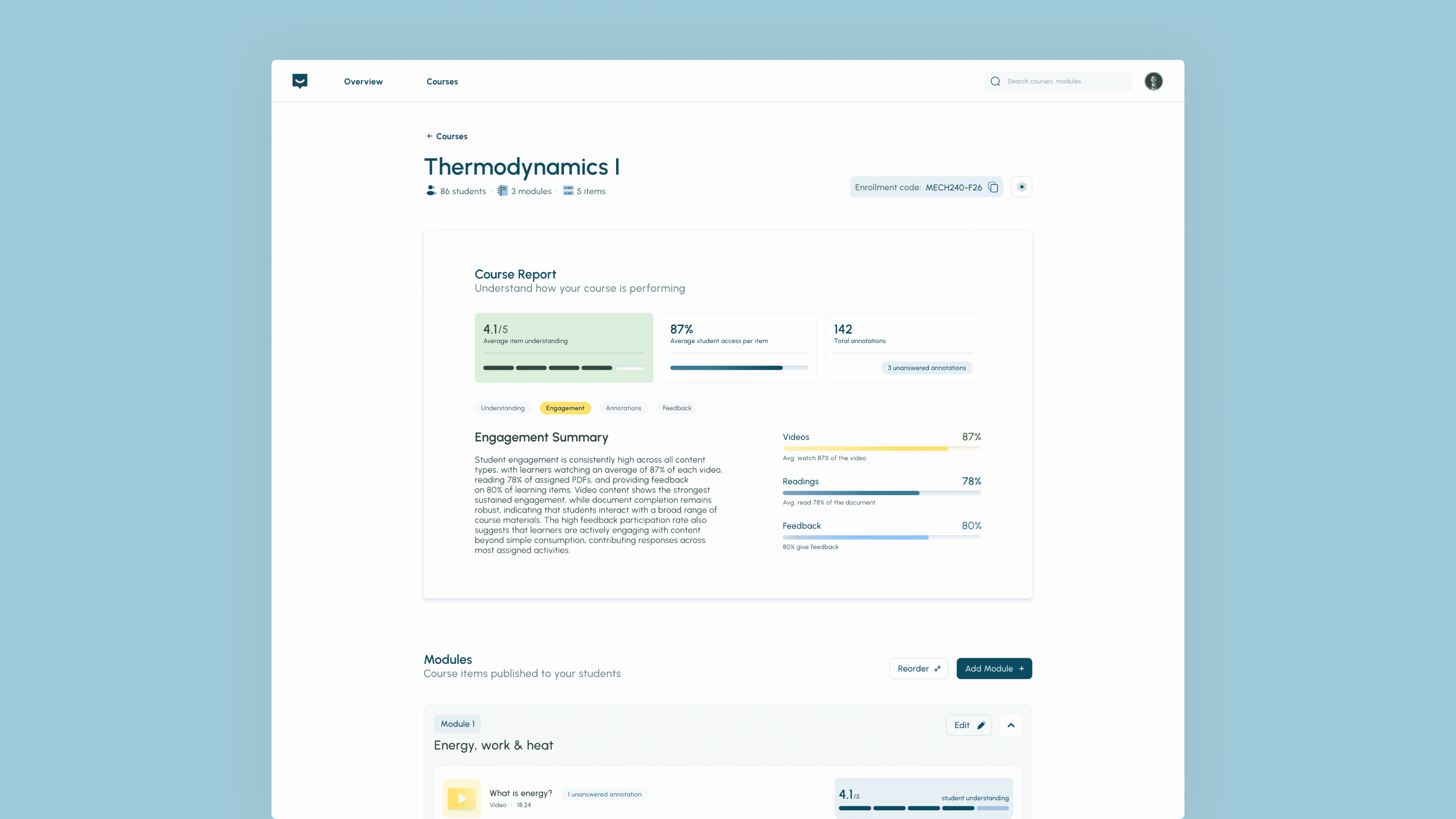
The redesign is created as a report with different sections, a single color indicator for course data overall, and explanations about the data shown.
The redesign is created as a report with
different sections, a single primary color indicator,
and explanations about the data shown.
The redesigned report begins with three summary cards showing average understanding, average item views, and total annotations, providing an immediate overview of course activity. More detailed insights are organized into topic based tabs, with charts followed by short explanations that help instructors interpret the data instead of drawing conclusions from graphs alone.
The redesigned report begins with three summary cards showing average understanding, average item views, and total annotations, providing an immediate overview of course activity. More detailed insights are organized into topic based tabs, with charts followed by short explanations that help instructors interpret the data instead of drawing conclusions from graphs alone.
Building a brand that serves two audiences
The redesign extended beyond the interface to include a complete brand identity, illustration library, and reusable design system. Early visual explorations were more playful, but stakeholder discussions reinforced that instructors were the platform's primary users.
The redesign extended beyond the interface to include a complete brand identity, illustration library, and reusable design system. Early visual explorations were more playful, but stakeholder discussions reinforced that instructors were the platform's primary users.

1x
Rather than creating separate brands, I designed one shared system with subtle adaptations for each audience. Instructor screens use a more restrained visual language, while student screens introduce more gradients, illustrations, and the Gochi Hand typeface to create an engaging experience without sacrificing consistency.
Rather than creating separate brands, I designed one shared system with subtle adaptations for each audience. Instructor screens use a more restrained visual language, while student screens introduce more gradients, illustrations, and the Gochi Hand typeface to create an engaging experience without sacrificing consistency.

1x
INSTRUCTOR
The branding system aids in information communication while remaining approachable.
The branding system aids in information communication while remaining approachable.

1x
STUDENT
A more playful approach to the same design system brings excitement to the experience.
A more playful approach to the same design system brings excitement to the experience.
TESTING & ITERATION
The redesign continued to evolve through usability testing and stakeholder reviews, challenging initial assumptions
Usability Testing
Two (2) rounds of testing with ten (10) users each round, 5 students and 5 instructors.
Two (2) rounds of testing with ten (10) users each round, 5 students and 5 instructors.
*
*
Browse the landing page and describe the system
Browse the landing page and describe the system
*
*
Complete a list of tasks while thinking aloud
Complete a list of tasks while thinking aloud
Shifting away from a Learning Management System (LMS)
Testing consistently showed that participants interpreted the platform as a traditional learning management system, frequently comparing it to Blackboard and Canvas. This revealed that the instructor landing page emphasized course management instead of the platform's core value as an annotation tool that provides insights.
Testing consistently showed that participants interpreted the platform as a traditional learning management system, frequently comparing it to Blackboard and Canvas. This revealed that the instructor landing page emphasized course management instead of the platform's core value as an annotation tool that provides insights.

1x
I rewrote the landing page copy and redesigned the instructor course page to focus on engagement data and learning insights rather than modules by putting the course report as the primary element above the fold. For students, the familiar course and module structure was preserved to match existing mental models, while recommendations, notifications, and study activities were prioritized within the hierarchy.
I rewrote the landing page copy and redesigned the instructor course page to focus on engagement data and learning insights rather than modules by putting the course report as the primary element above the fold. For students, the familiar course and module structure was preserved to match existing mental models, while recommendations, notifications, and study activities were prioritized within the hierarchy.
Further reducing effort for instructors
Usability testing revealed an unexpected workflow gap. Participants wanted to upload individual learning resources, but the platform required them to create an entire course before adding a single item. While users could complete the workflow, testing showed that the process introduced unnecessary effort for a common task.
Following this finding, discussions with stakeholders explored ways to simplify the workflow without compromising the overall course structure. I suggested we allow instructors to upload standalone videos and documents directly from the dashboard.
Usability testing revealed an unexpected workflow gap. Participants wanted to upload individual learning resources, but the platform required them to create an entire course before adding a single item. While users could complete the workflow, testing showed that the process introduced unnecessary effort for a common task.
Following this finding, discussions with stakeholders explored ways to simplify the workflow without compromising the overall course structure. I suggested we allow instructors to upload standalone videos and documents directly from the dashboard.
UPLOAD SINGLE ITEM
A simple way for instructors to upload course items unrelated to a specific course.
A simple way for instructors to upload course items unrelated to a specific course.
During these discussions, the original 'For Class' annotation tag was also refined into 'For Later', preserving the interaction while making it suitable for online teaching and future research or business contexts.
During these discussions, the original 'For Class' annotation tag was also refined into 'For Later', preserving the interaction while making it suitable for online teaching and future research or business contexts.
OUTCOME
High-fidelity usability testing evaluated the redesign against the project's primary goals, resulting in the following:
High-fidelity usability testing evaluated the redesign against the project's primary goals, resulting in the following:
68%
68%
of students voluntarily submitted feedback
of students voluntarily submitted feedback
37%
less time to locate course insights
76%
students felt acknowledged by instructors
37%
less time to locate course insights
76%
students felt acknowledged by instructors
1
1
This project reinforced that meaningful engagement comes from making existing interactions more valuable, not simply adding new functionality.
This project reinforced that meaningful engagement comes from making existing interactions more valuable, not simply adding new functionality.
2
2
Through this project, AI went from experimentation to quickly becoming a valuable design tool, which motivated me to continue exploring (until my credits ran out…) how AI can support creative thinking and iteration.
Through this project, AI went from experimentation to quickly becoming a valuable design tool, which motivated me to continue exploring (until my credits ran out…) how AI can support creative thinking and iteration.

createdbylib@gmail.com
© 2026 Libby Wilken
createdbylib@gmail.com
© 2026 Libby Wilken
createdbylib@gmail.com
© 2026 Libby Wilken